Overview
Dashboard Redesign for Peppermint
Peppermint is an online clubhouse curated specifically for modern experienced adults aged 55 and older, to pursue their passions and find new ones. In this internship project, I pitched the dashboard redesign project to increase product efficiency.
Role
User experience design, visual design, content strategy, branding
Time
6 weeks, 2023
Team
Craig Parks, Content Head; Diego Schmunis, Product Manager
⚖️ Challenge
Experienced adults have long been underserved in the current digital era. Currently, most websites targeted to this community oftentimes discourage users and trigger negative thoughts about aging.
We seek a way to delight and engage users, in order to empower them to discover and embrace the beauty of their age and, at the same time, achieve accessibility.
🎯 Goals
1) Find out the problems of the dashboard. 2) Improve the site structure. 3) Clarify Peppermint’s core actions. 4) Increase user retention and engagement
🗂Solutions
A redesigned dashboard with increased accessibility based on ADA requirements, clear CTA, improved hierarchy, effective navigation bar, and gamified engaging elements.
Usability Testing - Original Design
Progress
Methodology
Moderated usability testings, Semi-structured interviews
Metrics
SUS, CSAT, NPS
Participants Tested
7
“The layout is confusing…I will have to scroll endlessly, without finding anything I want.”
“I appreciate the large fonts, but would rather see a complete title.”
Usability Testing - Original Design
Result
80%
participants thought the dashboard was only acceptably good.
40%
participants found the navigation bar hard to understand.
20%
participants thought Peppermint has a clear concept.
Ideation
Affinity Mapping
Through affinity mapping, I discovered that the current problems of the dashboard fell into the categories of inefficiency, inconsistency, and low discoverability.
Based on problems, I brainstormed 20 actionable insights, ranging from accentuating CTA to clarifying content layout.
Design
Iteration 1.0: How might we help users navigate through the homepage content effortlessly?
Design
Dashboard layout
Since users’ biggest problems were confused with what they were supposed to do on Peppermint and where they can find the content they needed, I organized each content formation into fixed positions, added ample information on content cards, and stressed the call-to-action buttons.
Before - Dashboard layout: endless scrolling
After - Dashboard layout: each format located in fixed positions
Design
Navigation Bar
Specifically, I redesigned the information architecture by categorizing content by first format and then content topics. People might have different interpretations of topics, but they have the same understanding of each format.
After - categorizing firstly by format increases the discoverability
Design
Content Card
Insufficient information is another reasons why users feel confused with what Peppermint presents. Therefore, in the first iteration, I added detailed information to content cards.
Before - insufficient information
After - detailed explanation
However…
“This is very informational, but Peppermint is to inspire, not just to inform. We aim to attract, encourage users to spend more time on Peppermint, and keep users coming back.”
said Rich Maggiotto, CEO of Peppermint.
With that said, the dashboard redesign aims to increase the retention rate, users’ time spent on the site, pages/session, returning rate, and decrease the bounce rate.
Therefore…
Iteration
Iteration 2.0: How might we map out the dashboard to engage and inspire users?
Iteration
Design Principles
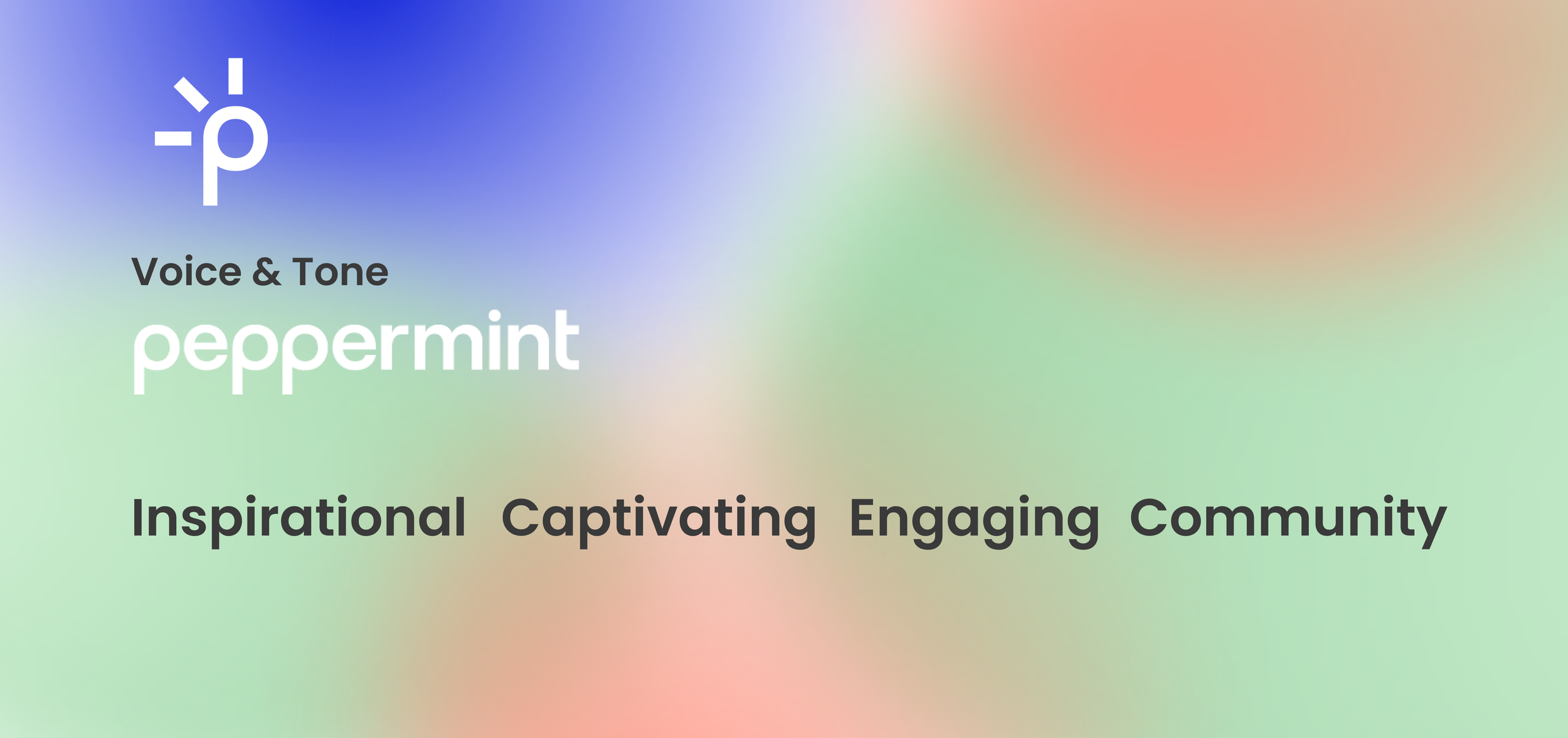
Not taking brand tone into consideration leads to an overwhelming dashboard full of CTA buttons. This time, I reset guidelines as inspiring, easy to focus, engaging, and fun.
Iteration
Sketches
Iteration
Low-Fidelity Design
Iteration
High-Fidelity Design
User Flow
Usability Testing - The Final Solution
Progress
Methodology
Follow-Up Interviews
Metrics
System Usability Scale (SUS) Customer Satisfaction Score (CSAT) Net Promoter Score (NPS)
Participants Tested
7
“The new site is so clean and organized. Now I can easily focus on the content I want to consume.”
“I would never log off from this thing.”
Usability Testing - The Final Solution
Result
80%
(40% more)
participants felt very satisfied (9-10) with the updated dashboard.
100%
(80% more)
participants found the new navigation bar easy to understand.
100%
(80% more)
participants thought Peppermint has a clear concept with the new dashboard.
Reflection: Aging is just cool people getting cooler.
Include senior citizens in the digital world
The current growth of the population aged 55 and older is one of the most significant demographic trends in US history. This non-digital native group is severely underserved in the current technology landscape.
However, stepping into 55+ does not mean that they are not cool anymore, not intelligent anymore, or not open-minded anymore.
Therefore, don’t underestimate elder citizens, treat them equally. Design for their well-being instead of only accommodating physical limitations.
Combine users’ needs with brand tone
I overlooked the brand tone and mission in the first redesign. This leads to a highly utilitarian and informational dashboard instead of an inspiring, engaging, and tantalizing content feast. in the future, I will remind myself to design with the brand tone to tell the product’s story.


