Overview
Redesign the Blog Reading Experience for OURA
OURA Ring’s blog aims to educate users on health knowledge so that users can better harness OURA Ring. Ultimately, it intends to increase the retention rate and grow the conversion rate. I approached these two problems with a redesign focusing on a clear and interactive reading experience.
Role
UX design, content design, visual design
Time
6 weeks, 2023
Team
Samir Sheth, Content SVP; Locke Hughes, Editor in Chief
⚖️ Challenge
Despite the rich content of OURA’s blog, users complained about inadequate information to utilize the ring. Therefore, OURA Ring reaches out for a way to reorganize the site structure to increase SEO performance and discoverability. Science content could be daunting. OURA seeks a way to keep users circulating through the content and make the content sticker.
🎯 Goals
1) Increase discoverability. 2) Enhance the content circulation. 3) Drive more traffic to PDP. 4) Improve the retention rate, conversion rate, and brand loyalty
🗂 Solutions
A blog layout with improved information architecture, an efficient navigation bar, community features, and multimedia content format.
Research
User Reviews
OURA ring’s users prioritize their health and wellness. They are actively searching for content that provides insights, tips, and strategies to lead healthier lives. Users want easily accessible and comprehensive content that addresses their health concerns, guides them toward healthier choices, and empowers them to make informed decisions.
While using the product to make these decisions, however, users don’t know how to interpret the data report, despite the rich content on OURA’s blog.
“Readiness is a top-line score that we didn’t know what to do with. It didn’t provide any surprising insights that were actionable. Activity doesn’t provide anything more than a fitness tracker.”
Research
Affinity Diagram
After collecting user reviews online, I summarized the current problems into four categories: discoverability, monotonous content, weak community sense, and interrupted reading experience.
Design
How might we improve users’ reading experience and create a sense of community on the blog page?
Design - Great Reading Experience
Information Architecture and Navigation Bar
I redesigned the information structure and clarified the messaging in the navigation bar to increase content discoverability. In this way, users can find the topics they are interested efficiently.
Navigation bar before:
Navigation bar after:
Design - Great Reading Experience
Anchor Links
Due to SEO concerns, blog articles should remain as long as above 1200 words which deters users. Anchor links summarize the long text content and help users focus on their interests.
Design - Great Reading Experience
Infographics
Infographics are a popular and efficient way to present science content. For articles with extremely long bodies and hardcore science knowledge, infographics present the science knowledge in an engaging way.
Design - Great Reading Experience
The Right Rail
In the original version, hyperlinks embedded in the article interrupt users’ reading. In the new design, I put related articles and links to the product detail page on the right rail. In this way, users can easily circulate through the articles without being disrupted.
Design - The Sense of Community
Community Discussion
In the community discussion, users can see others’ understanding of the articles and ask questions. This helps boost the community sense and increase engagement.
Design - The Sense of Community
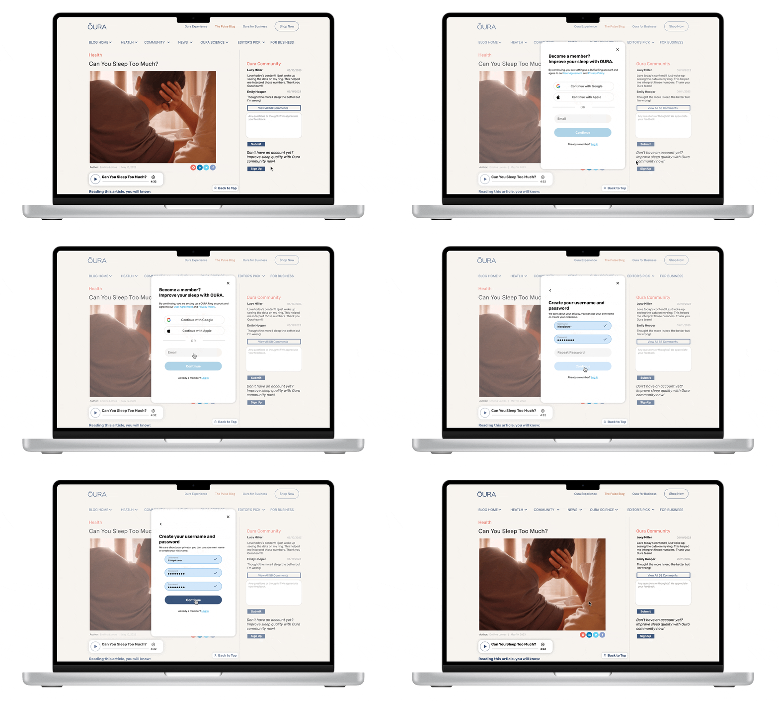
Join Membership
Adding a “create an account” feature can help users stay in the know and build community. It’s also an efficient way to acquire more user leads.
Build Great Reading Experience within Constraints
Reflection
Design with business objectives and SEO constraints
Integrating SEO considerations and business objectives into the reading experience is essential to this project. Constraints from SEO performance include the blog length, embedded articles, and sound site structure.
With these in mind, design solutions such as further categorizing the nav bar, dividing the blog page into two rails, embedding anchor links, and moving read more articles to the right rail create a smooth, efficient, and enjoyable reading experience for users.
Next steps
Usability Test: Interview users and further improve the design solution
A/B testing: compare the original blog site with the current design solution among users
SEO performance evaluation: try out the new site structure and see whether it hits a higher SEO score


